Germanic American Institute Website Redesign
Led a full UX redesign of the Germanic American Institute website, using survey insights and card sorting to replace dropdown-heavy navigation with a structured mega menu that improves program visibility, donation access, and mobile usability.

Role: UX Designer, Researcher and Website Creator
Scope: End-to-end — Research →Journey mapping→ IA → Visual Design → Launch
Impact: Clearer navigation structure, program discovery, stronger calls to action, and responsive design.
Collaboration: Marketing Manager, Director and Internal departments
62
survey participants
15
card sorting participants
45
content cards sorted
5→6
navigation items restructured
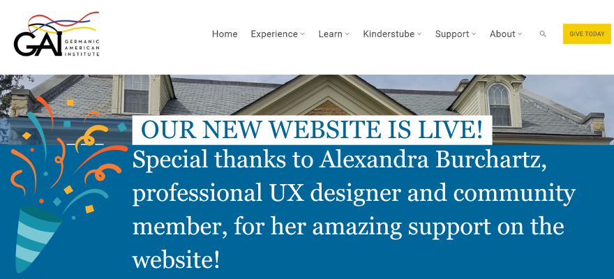
Live
at gaimn.org
WHAT’S INSIDE
Contents & Highlights
Click any section to jump directly to it.
9 core issues, strategic objectives, before screenshots
Survey data, in-person card sort, affinity mapping
3 user types, pain points, emotions, opportunities
What launched, hypotheses, reflection
Old vs new structure, research-to-decision rationale
Mega-menu system, mobile, videos
01 — PROBLEM & GOALS
A site with strong content held back by its structure
The GAI's website had everything users needed — but navigation that made it nearly impossible to find.
The problem
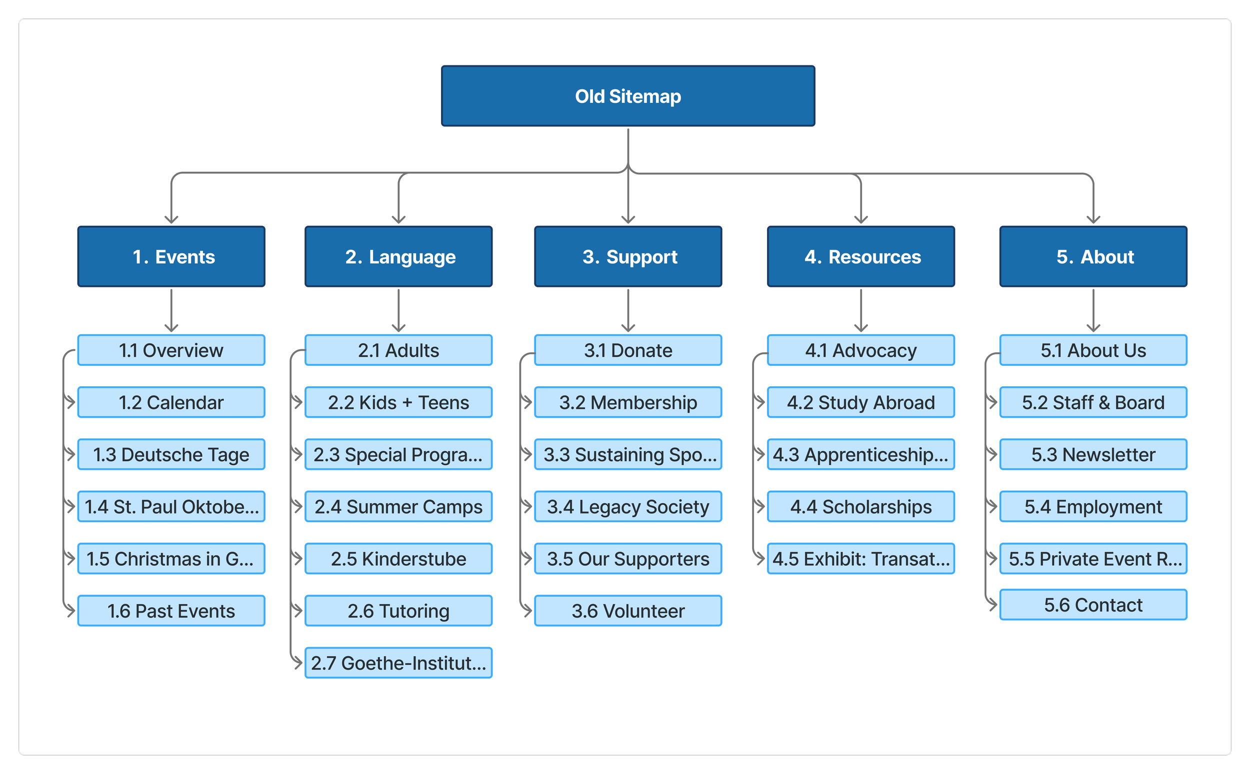
GAI's website had strong content but lacked structural clarity. Key offerings were hidden within dropdown-heavy navigation, redundant pages created unnecessary steps, and inconsistent layouts across devices weakened usability.
The core navigation used five items — Events, Language, Support, Resources, About — structured around the organization's internal departments rather than how users actually arrived on the site and what they were trying to accomplish.
“It is cumbersome to navigate. The education page feels like its own separate website.”
-GAI Member
“I find it difficult to flow between the main page and the language education page. It doesn’t flow.”
-GAI Member
Strategic objectives
Discoverability
Elevate major offerings — programs, preschool, events, donations — and make them immediately findable from primary navigation
Previous website experience
PREVIOUS HOMEPAGE
Core issues identified
Dropdown-heavy navigation buried important content
Preschool (Kinderstube) not represented in primary navigation
Donation pathways lacked visibility — buried under Support
Competing right-side menus created visual clutter mid-page
Extra landing pages added unnecessary steps to registration
Outlined buttons not perceived as clickable by users
Layout inconsistencies across devices made site non-mobile-friendly
Programs and events were difficult to discover for new visitors
Simplicity
Reduce unnecessary pages, eliminate competing navigation elements, and clarify registration and engagement pathways
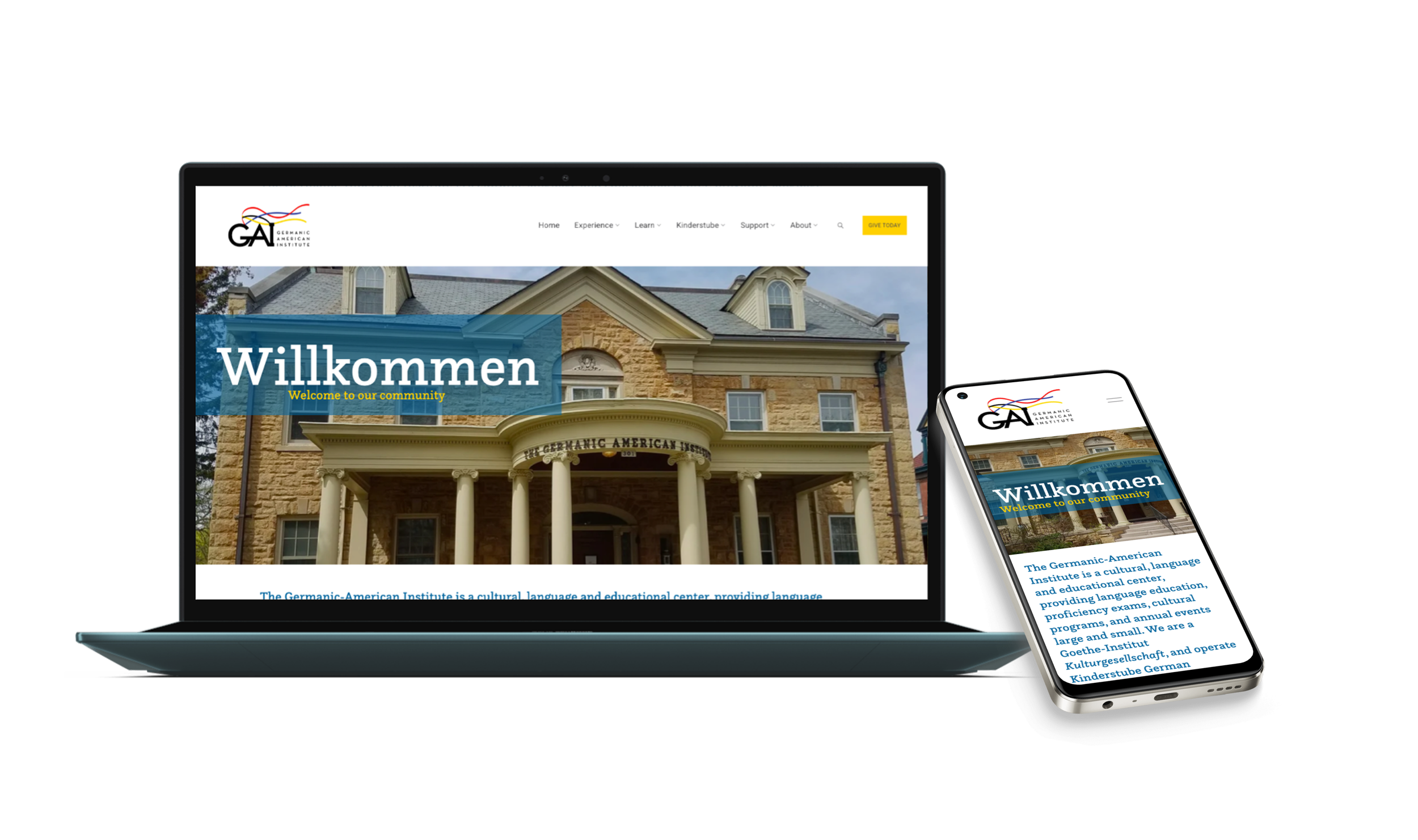
Responsiveness
Deliver a fully consistent experience across desktop, tablet, and mobile — addressing the 52% of users who accessed the site on a smartphone
The original site used plain text dropdowns with no visual context, a blue hero with yellow text that failed contrast standards, and a language page that functioned as a completely separate subdomain.
PREVIOUS DROPDOWN NAVIGATION
02— RESEARCH & DISCOVERY
Two methods, 77 participants, one clear signal
Rather than redesigning based on assumption, I ran parallel research activities to understand how real users navigate — and how they mentally organize the GAI's content.
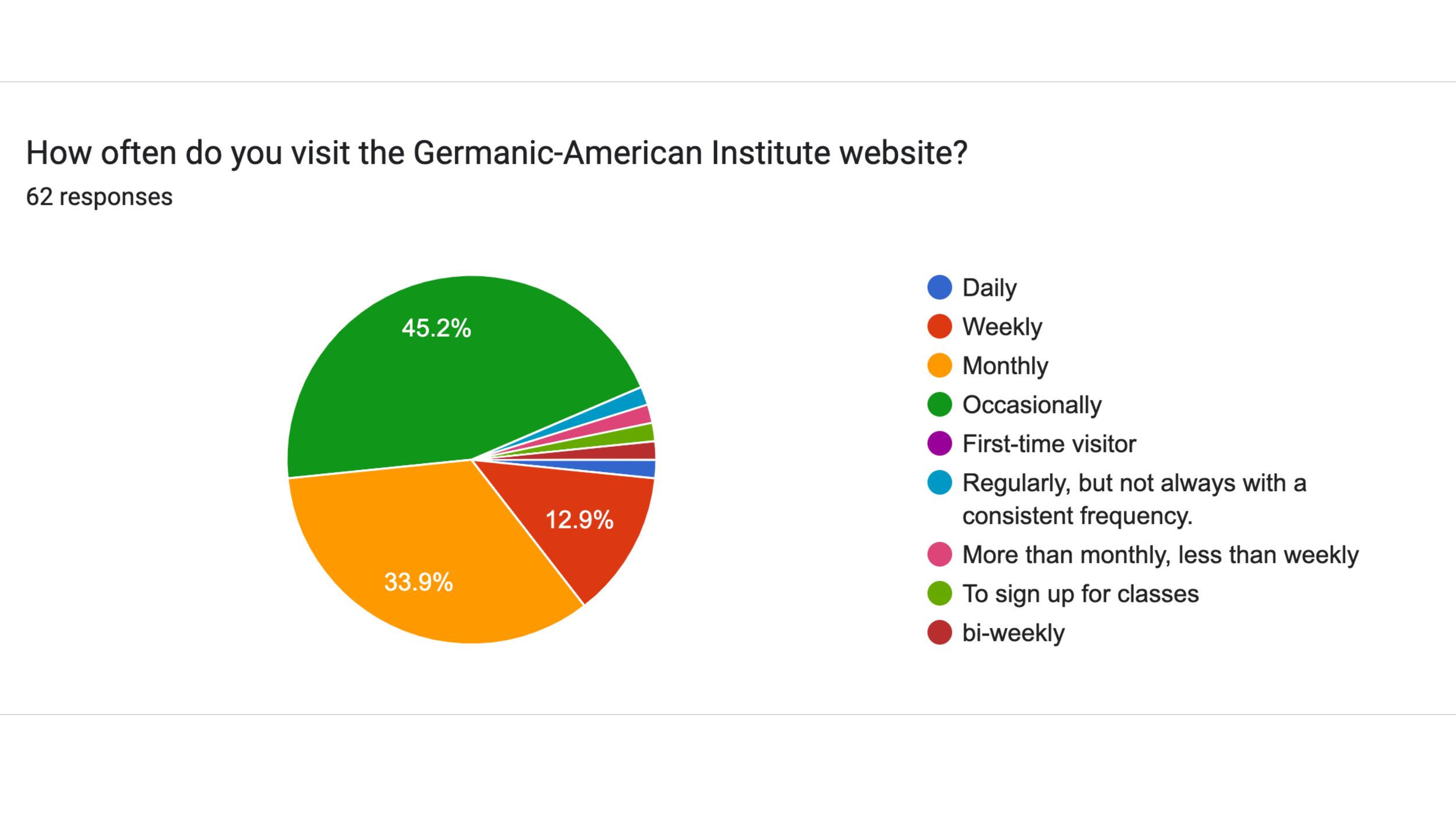
62
Survey participants — members, students, staff, donors, volunteers
15
In-person card sort participants across age groups and proficiency levels
METHOD 1
Survey & questionnaire
A 25-question survey distributed to GAI members, language students, staff, donors, and volunteers. Covered navigation usability, content findability, device usage, satisfaction with key flows (registration, donation, calendar), and open-ended frustrations.
Key findings
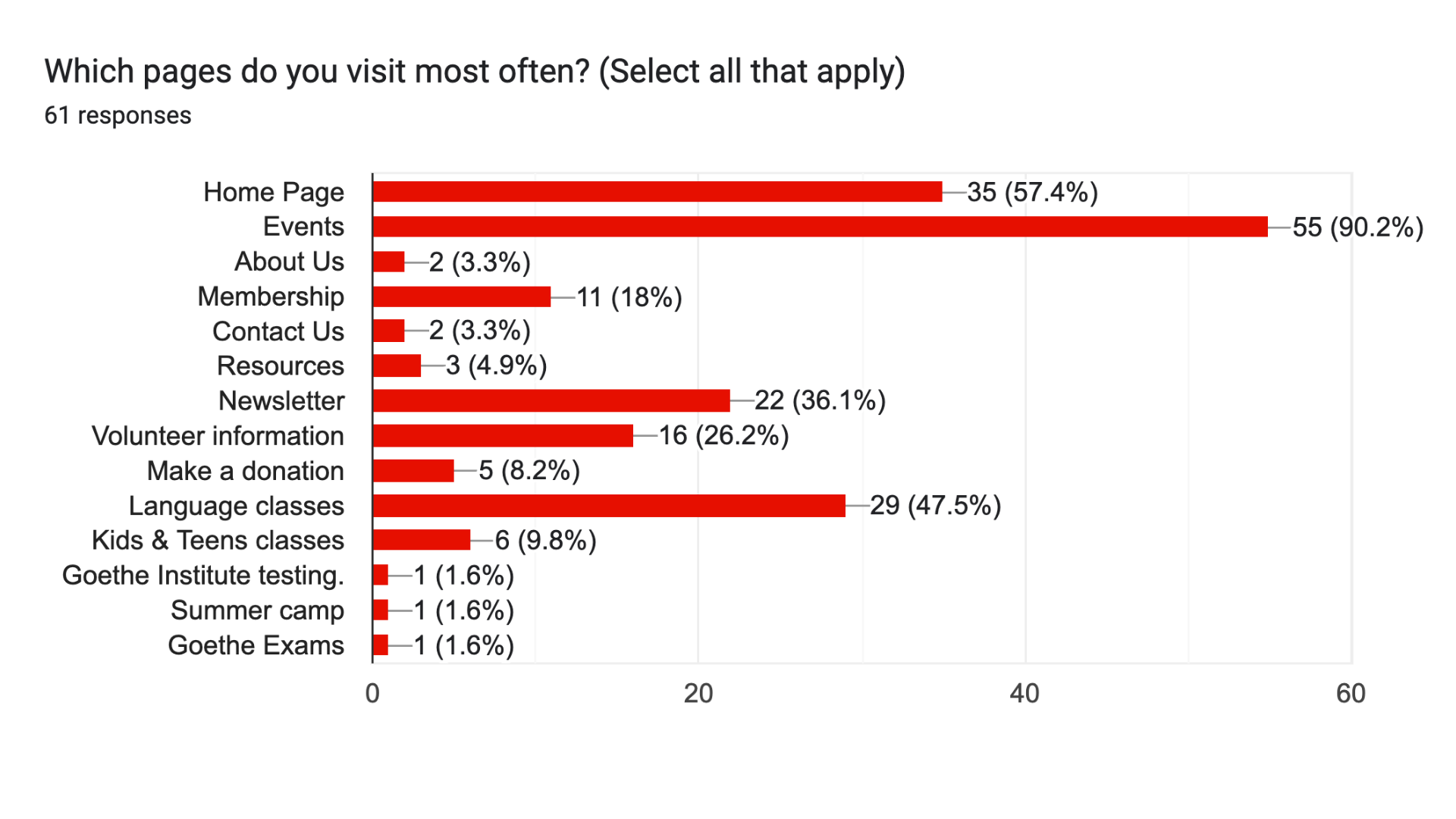
90.2% of respondents visited the Events section most — yet found it difficult to navigate
47.5% regularly used Language classes pages but described the experience as a separate website
52% accessed the site primarily on a smartphone; mobile experience was inconsistent
Registration for classes & events was the #1 most-requested improvement (39 of 62 respondents)
Calendar discoverability was the second most cited pain point
Positive feedback on brand colors, photography, and community content
45
Content cards sorted into user-defined categories during the card sort
Survey response data — 62 participants
Primary User Groups
In-person open card sorting exercise — GAI, Saint Paul
METHOD 2
In-person open card sorting
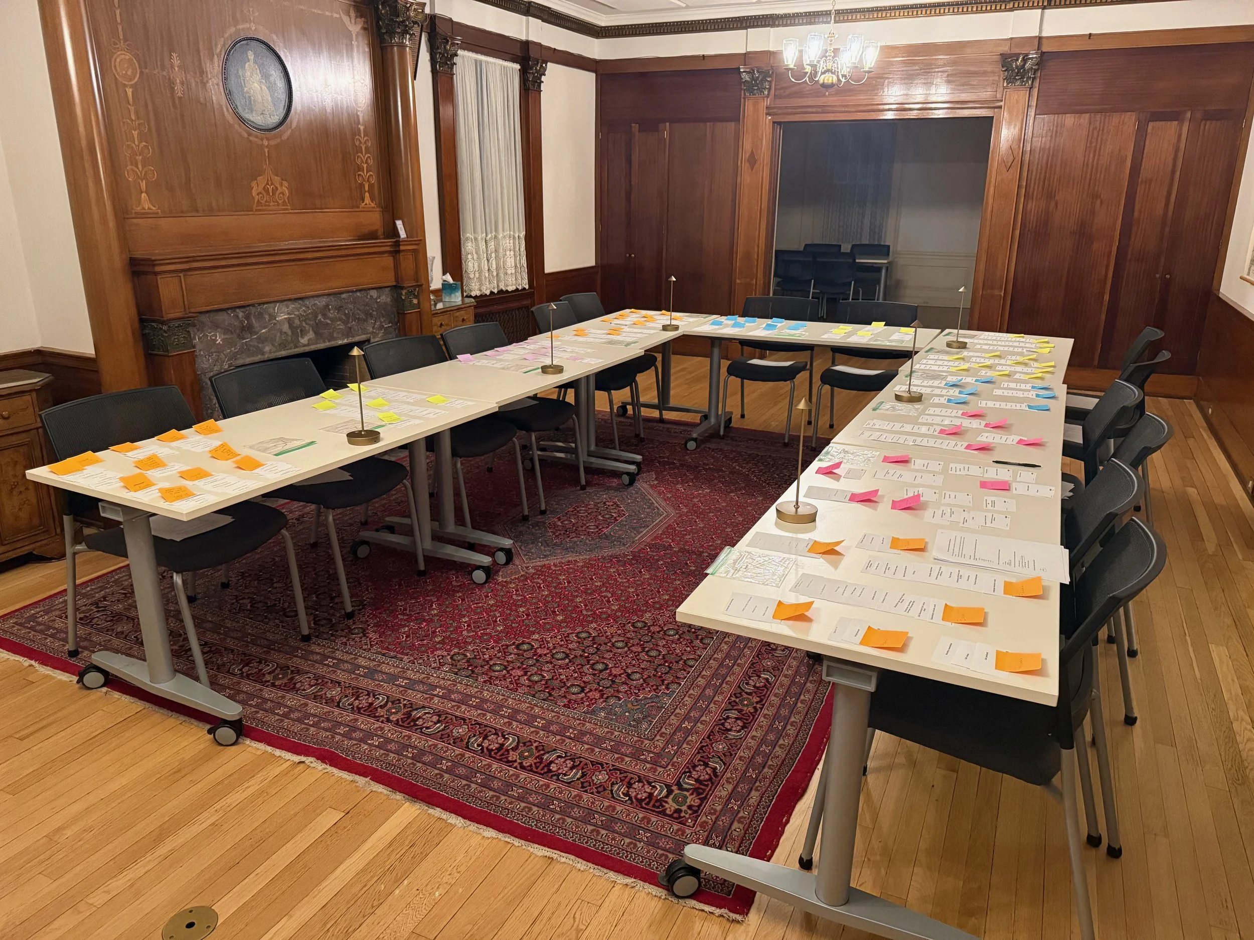
15 participants sorted 45 content cards representing the full GAI website into self-defined categories, then labeled those categories in their own words. Participants ranged in age, German language proficiency, and proximity to the GAI.
Patterns identified
Kinderstube consistently grouped as its own independent category — not under Language
Events and classes expected to live together; cultural vs. educational distinction was secondary
Strong preference for broader, flatter categories over deep nested dropdowns
Clear separation between programs (what we do) and community resources (how to get involved)
Donation, legacy giving, and corporate sponsorship grouped separately from volunteering and membership
Impact: Card sort data directly informed every naming and grouping decision in the new navigation structure.
Key research insights & affinity mapping
Survey responses were synthesized through affinity mapping, clustering feedback into themes across navigation, events, programs, and community.
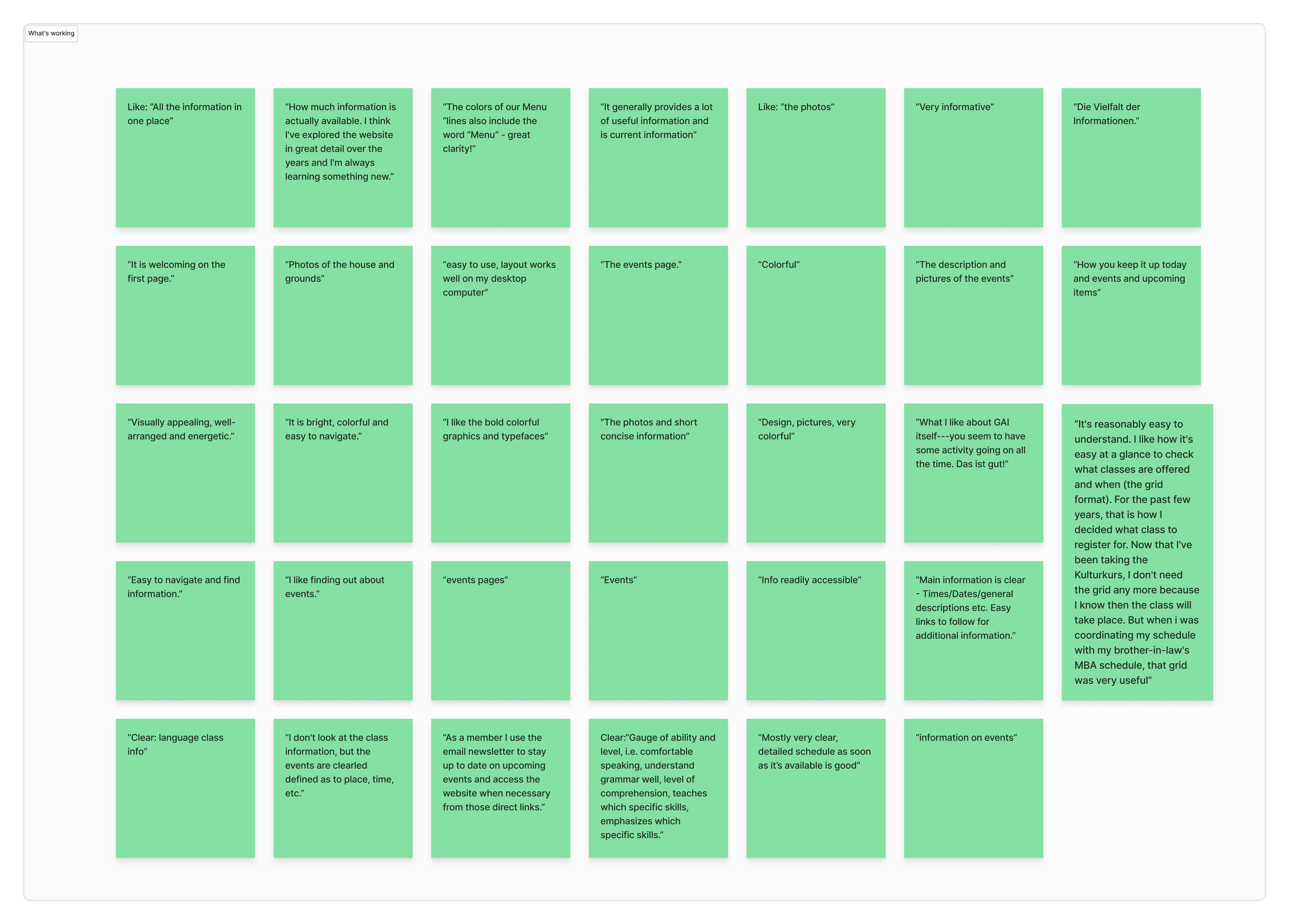
What Was Working
Strong community interest in programs
Brand colors resonated positively
Photography increased engagement
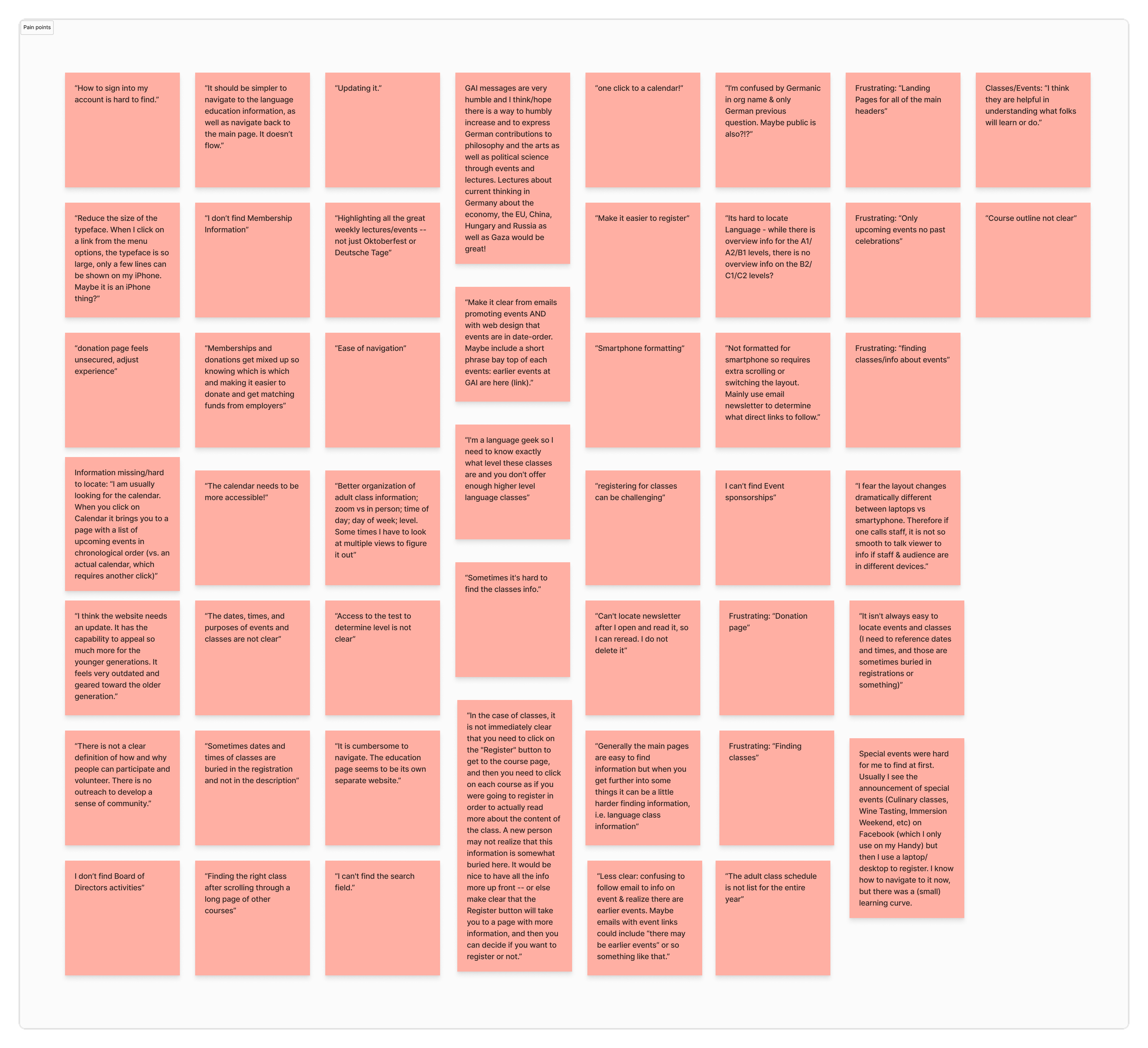
Pain Points
Programs hidden behind navigation layers
Unclear class registration steps
Confusing button styles
Inconsistent mobile layouts
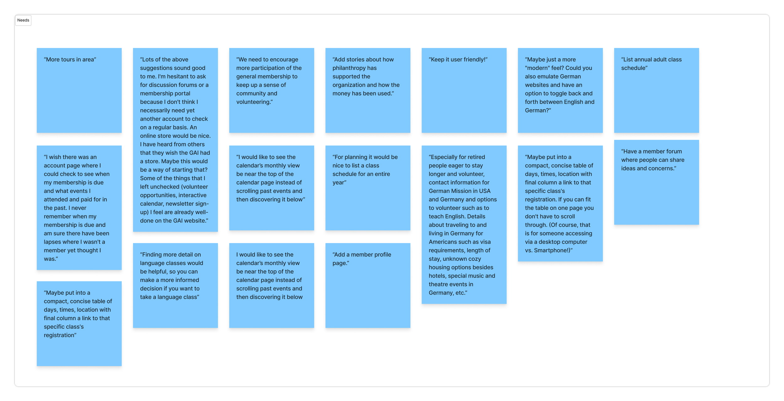
Needs
Immediate visibility of major offerings
Fewer steps to register
Clear language and action cues
Consistent experience across devices
Research synthesis
Survey and card sort data revealed that while users valued the GAI's programming and sense of community, the website made it difficult to find key offerings efficiently. Navigation felt unintuitive, with language programs, events, and the preschool buried within dropdowns or disconnected from the main site experience.
Event and class information was fragmented, donation and membership paths caused confusion, and mobile layouts required excessive scrolling. These insights informed a restructured sitemap, a clearer content hierarchy, and the introduction of a mega-menu that surfaced high-priority programs.
03— USER JOURNEY MAP
How three key user types moved through the site
Mapping the journey before redesign revealed where friction compounded — and where a single structural change could unblock multiple user types at once.
User Journey Map - Pre-Redesign Experience
Three primary user types mapped across five journey stages | Based on 62-participant survey + 15 in-person card sort
Prospective language student
Family researching Kinderstube Preschool
Existing member
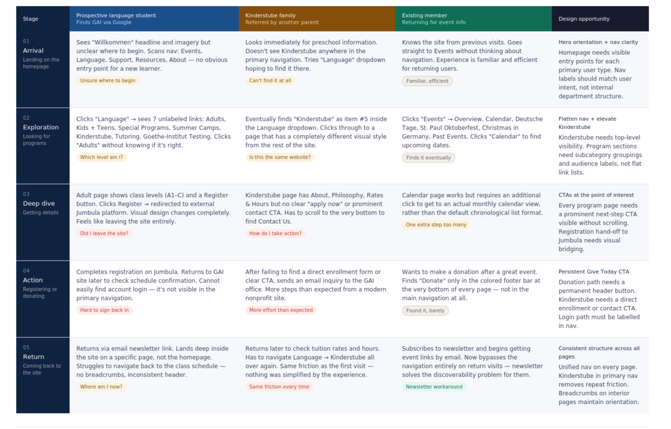
Journey map insight
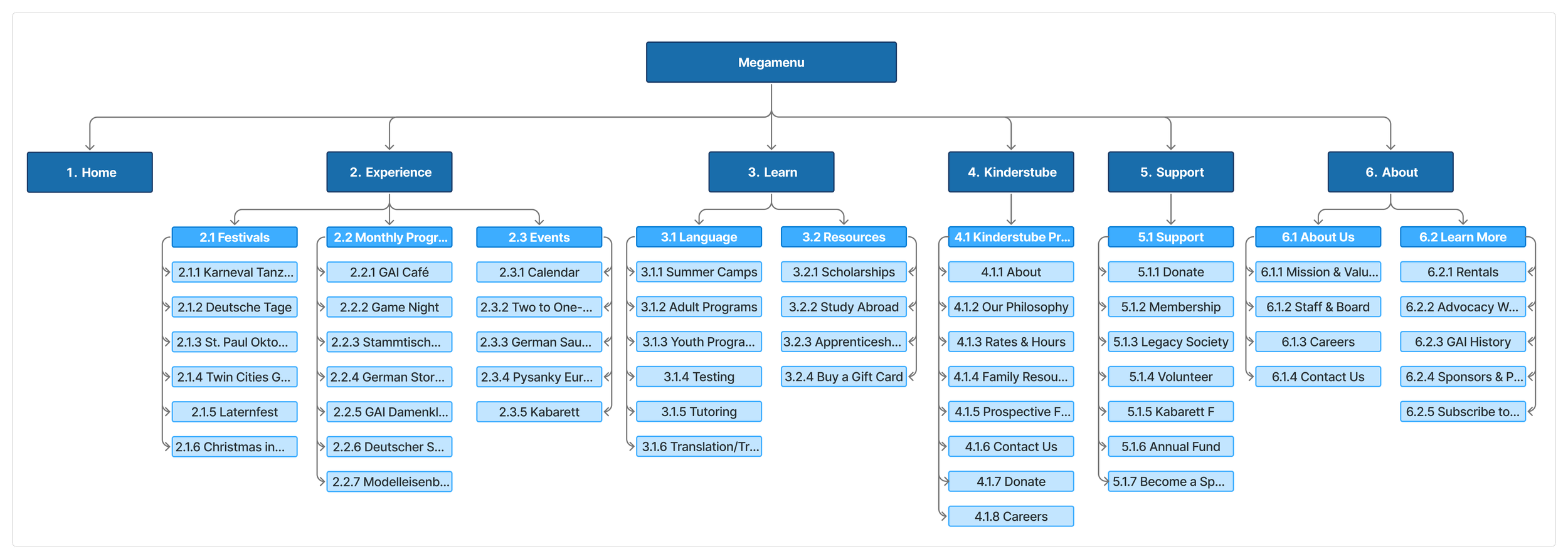
The Kinderstube family journey had the most compounded friction — three separate points of confusion before reaching a CTA. Elevating Kinderstube to a top-level nav item with its own mega-menu (About, Philosophy, Rates & Hours, Family Resources, Prospective Families, Contact, Donate, Careers) collapses a 4-step journey into a single hover interaction. This single change addressed the most consistently frustrated user group in both the survey and card sort data.
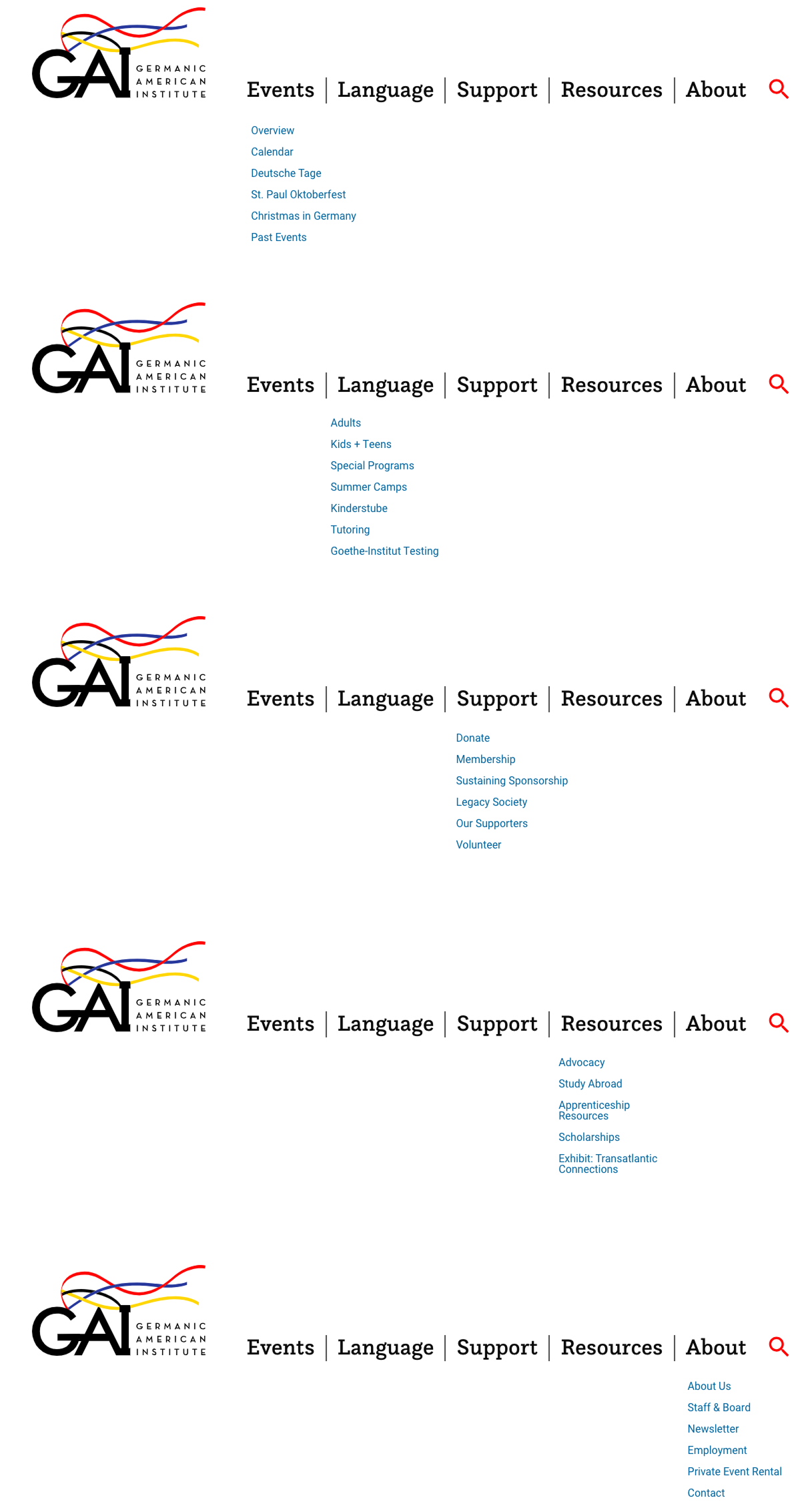
04 — INFORMATION ARCHITECTURE & SITEMAP
From internal logic to user mental models
Research revealed the primary issue was structural, not visual. The strategy focused on simplification — not adding complexity.
1
Research-to-decision rationale
Card sort finding → Kinderstube elevated to top-level nav
11 of 15 card sort participants placed Kinderstube content in its own independent category — never under Language. Despite this, it was buried as item 2.5 in a 7-item Language dropdown. Elevating it to a standalone nav section reduced the path to preschool information from 3+ clicks to one hover interaction.
2
Card sort finding → Events split into Experience subcategories
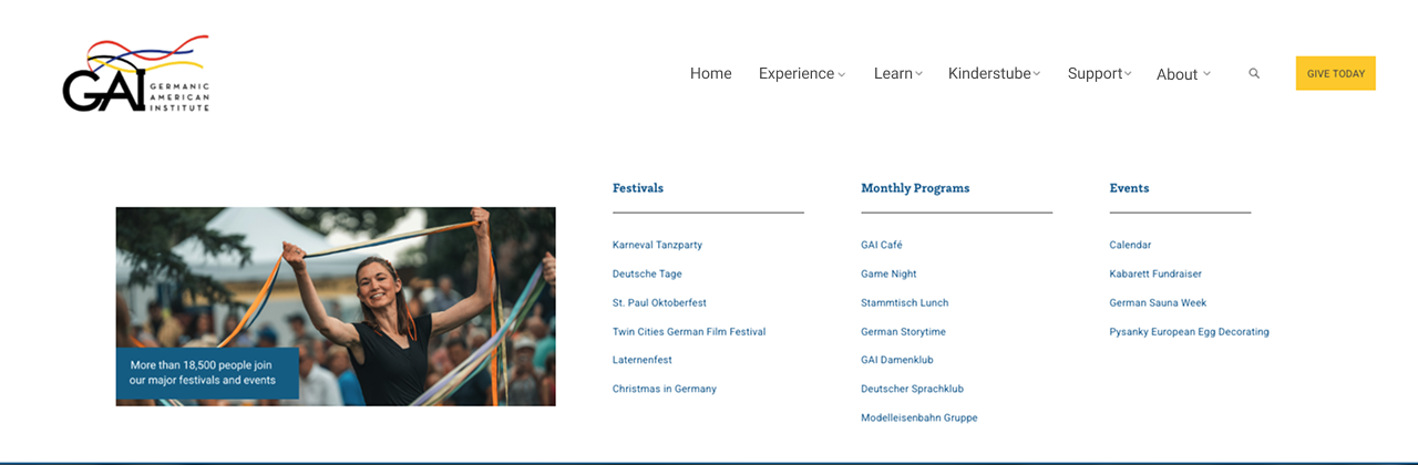
Participants consistently distinguished between annual festivals (Deutsche Tage, Oktoberfest), recurring monthly programs (GAI Café, Game Night, Stammtisch), and one-time events. The new Experience mega-menu reflects this with three distinct subcategory columns — matching the mental model shown in the data.
3
Survey finding → Donation CTA separated from Support nav
Survey respondents described confusion between donating and becoming a member — both lived under "Support" with no
visual distinction. 8.2% of respondents regularly used the donation page. Moving Give Today to a persistent header button
makes the path available without any navigation decisions, regardless of which page a user is on.
4
Survey finding → Right-side nav removed from interior pages
35–44 year old respondents specifically described the language section as feeling like "its own separate website." This was partly caused by a secondary right-column navigation system that appeared on class and program pages, creating a second independent nav structure. Removing it and integrating content under the mega-menu system restores consistency.
05 — DESIGN
Mega-menu system, visual redesign, and mobile
Three videos show the redesigned navigation, a full page walkthrough, and the mobile experience.
See it in action
Navigation sections walkthrough
EXPERIENCE
Desktop experience overview
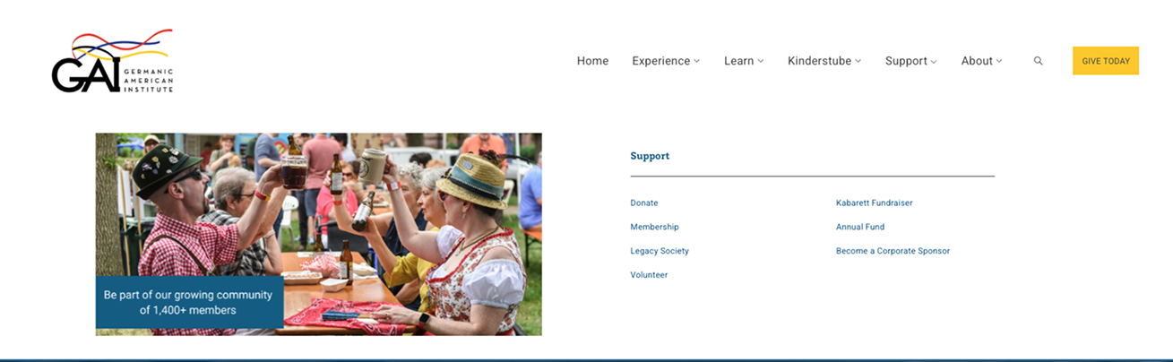
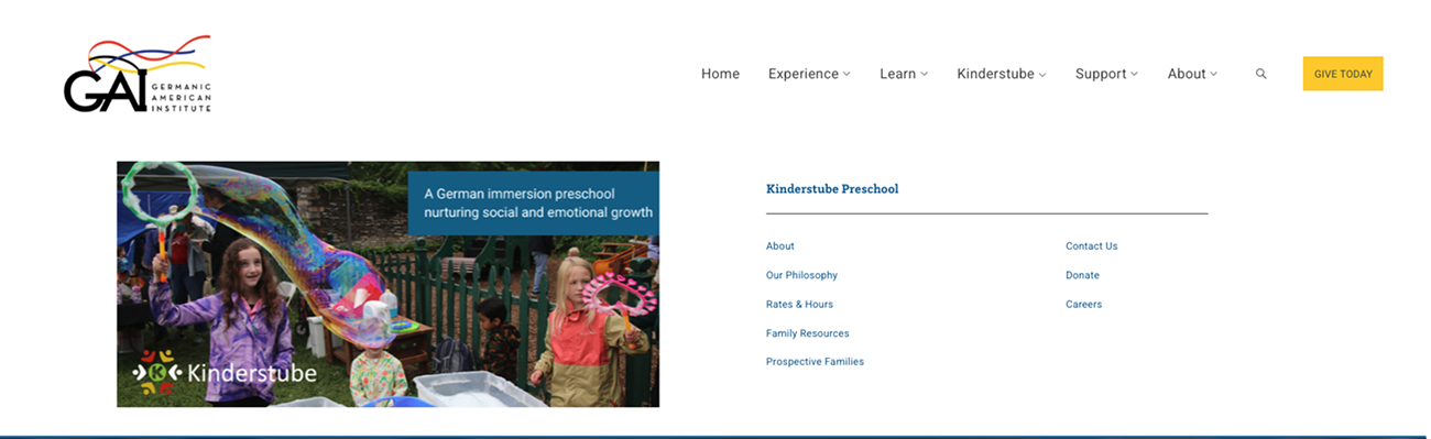
The mega-menu system
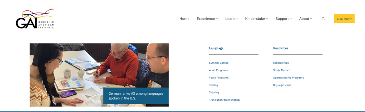
LEARN
ABOUT
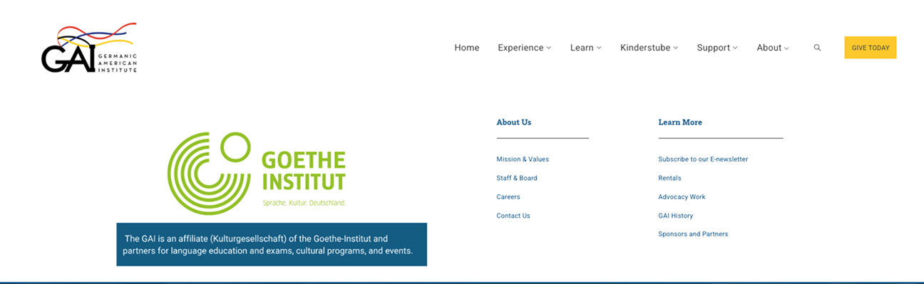
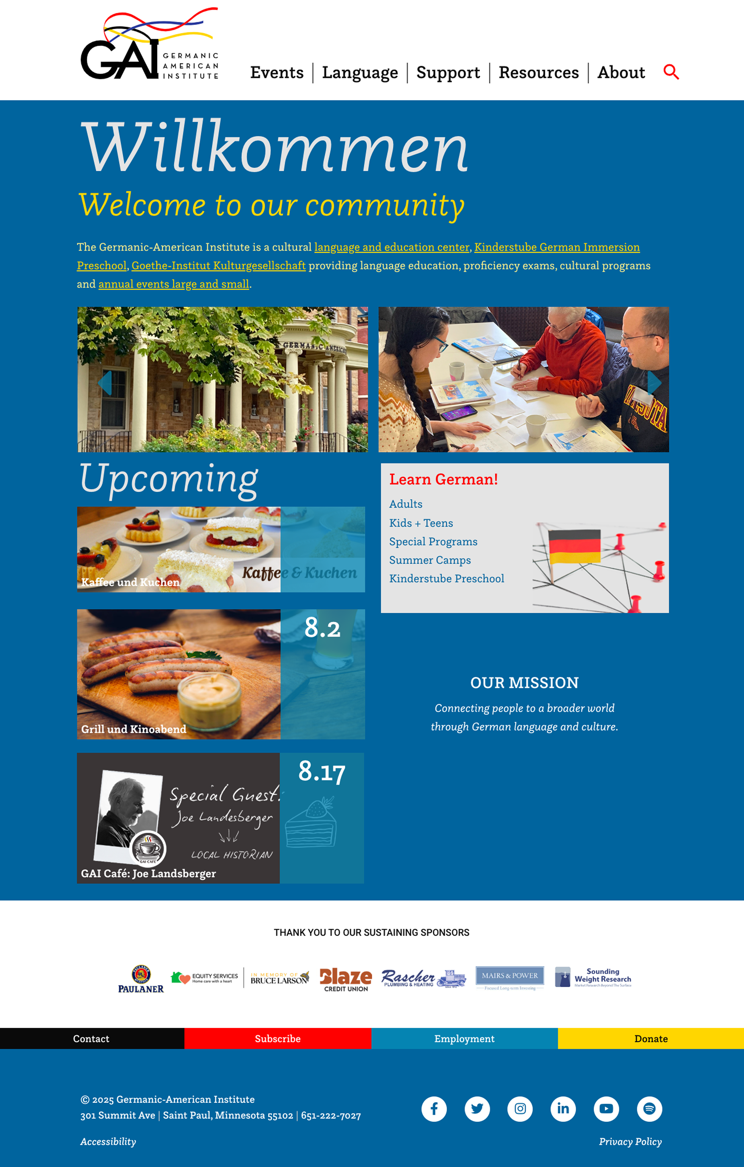
Each of the five navigation sections uses a full mega-menu panel with contextual photography, grouped subcategories, and plain-language labels. This replaced the plain text dropdowns that offered no visual context or orientation cues.
SUPPORT
Responsive mobile walkthrough
KINDERSTUBE PRESCHOOL
06 — OUTCOMES & IMPACT
A live site with research-validated structure
The redesign launched on gaimn.org. Every structural change maps directly to a research finding from the survey or card sort.
Live
Launched at gaimn.org
6
Navigation sections restructured from 5
What changed — and why it matters
5
Mega-menu panels with photography & subcategories
Kinderstube elevated to top-level navigation
11 of 15 card sort participants placed preschool content in its own category. Previously buried as item 2.5 inside a 7-item Language dropdown, it now has its own mega-menu panel.Mega-menu replaced plain dropdowns
Each panel includes subcategory groupings, contextual photography, and plain-language labels — addressing the survey finding that new visitors couldn't predict where content lived.Give Today separated from Support navigation
Donation CTA is now a persistent header button, removing ambiguity between financial giving and other Support-labeled actions (volunteering, membership).Cultural events and monthly programs distinguished
Experience mega-menu separates Festivals, Monthly Programs, and Events — matching the mental model shown consistently in card sort data.Competing right-side navigation removed
Interior pages no longer have a secondary browsing system, restoring visual consistency with the rest of the site.
Measuring success — what I'd expect to see
Post-launch analytics access was limited. Based on the research findings, these are the metrics I'd track to validate the redesign is working.
Hypothesis 1 — Kinderstube discovery
Elevating Kinderstube to a top-level nav item should increase direct navigation to the preschool section from the homepage. I'd look for an increase in Kinderstube page sessions as a proportion of overall site traffic compared to the previous period.
Hypothesis 2 — Donation path clarity
Moving the donation CTA to a persistent header button should reduce the number of steps between donor intent and action. With 8.2% of survey respondents regularly using the donation page, a persistent CTA should make that path accessible without any navigation decisions.
Hypothesis 3 — Reduced navigation-related support requests
Multiple survey respondents noted contacting staff when they couldn't find information. A structured mega-menu with subcategory labels should reduce "where do I find X" inquiries — particularly for class registration and event details, the two most-cited pain points.
1-click
Path to Kinderstube from any page (was 3+)
Testimonial
“Alexandra is an exceptional UX designer who played a key role in shaping the flow and overall user experience of our website. From early concepting through launch, she provided thoughtful research, clear design rationale, and steady support as we developed our new site.
She is a deeply committed professional who consistently goes above and beyond—asking the right questions, anticipating user needs, and offering solutions that balance usability, aesthetics, and organizational goals. Alexandra’s collaborative approach, attention to detail, and responsiveness made the entire process smoother and more effective.
I am grateful for her expertise and dedication. I would highly recommend Alexandra to any team seeking a UX designer who brings both strategic insight and genuine care to their work.”