Germanic American Institute
Improving navigation, engagement, and program discovery for a cultural non-profit
Overview
The Germanic American Institute (GAI) is a cultural organization dedicated to promoting German language learning, education, and community events. Their previous website struggled with low user engagement, unclear navigation, and fragmented content, making it difficult for users to find programs, events, and key resources.
I led the UX design for a full website redesign, collaborating closely with the Marketing Manager and gathering input from multiple departments—including Communications, Language Programs, Events, and the Institute Director—to ensure the experience aligned with both user needs and organizational goals.
My role: UX Designer and Website Creator
Collaboration: Marketing Manager, Communications, Language Programs, Events, Director
HCD Methods: Competitive analysis, user research, user personas, card sorting, affinity mapping, user flow analysis, low to high-fidelity wireframes, prototypes, usability testing.
Focus: UX research, information architecture, content strategy, UI design
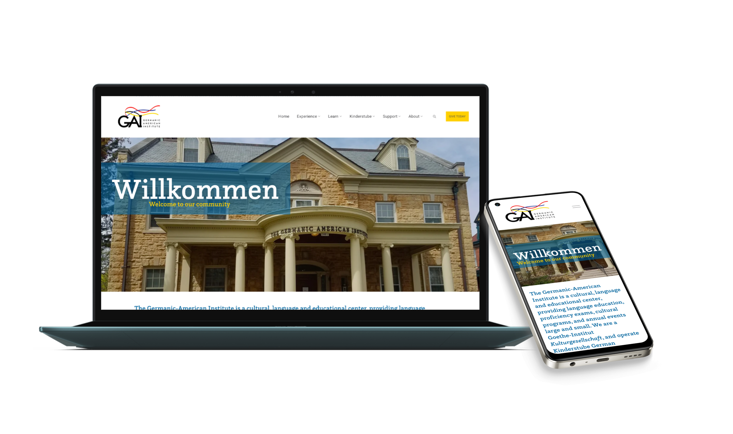
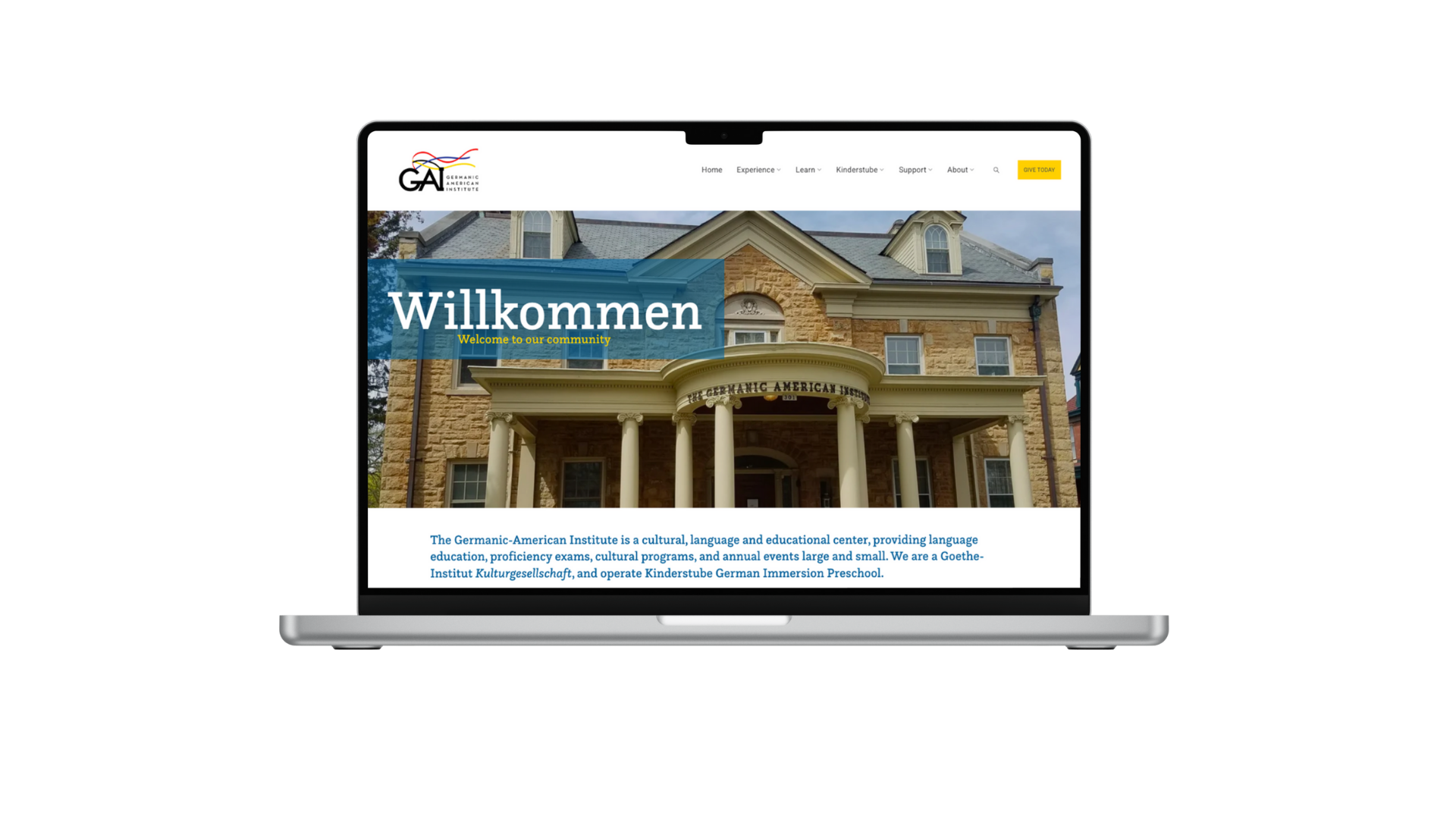
Features: Mega header for streamlined navigation, interactive event calendars, informative resource sections, user-oriented program descriptions.
Tools: Squarespace, Figma, Canva, Usability Hub, Unsplash
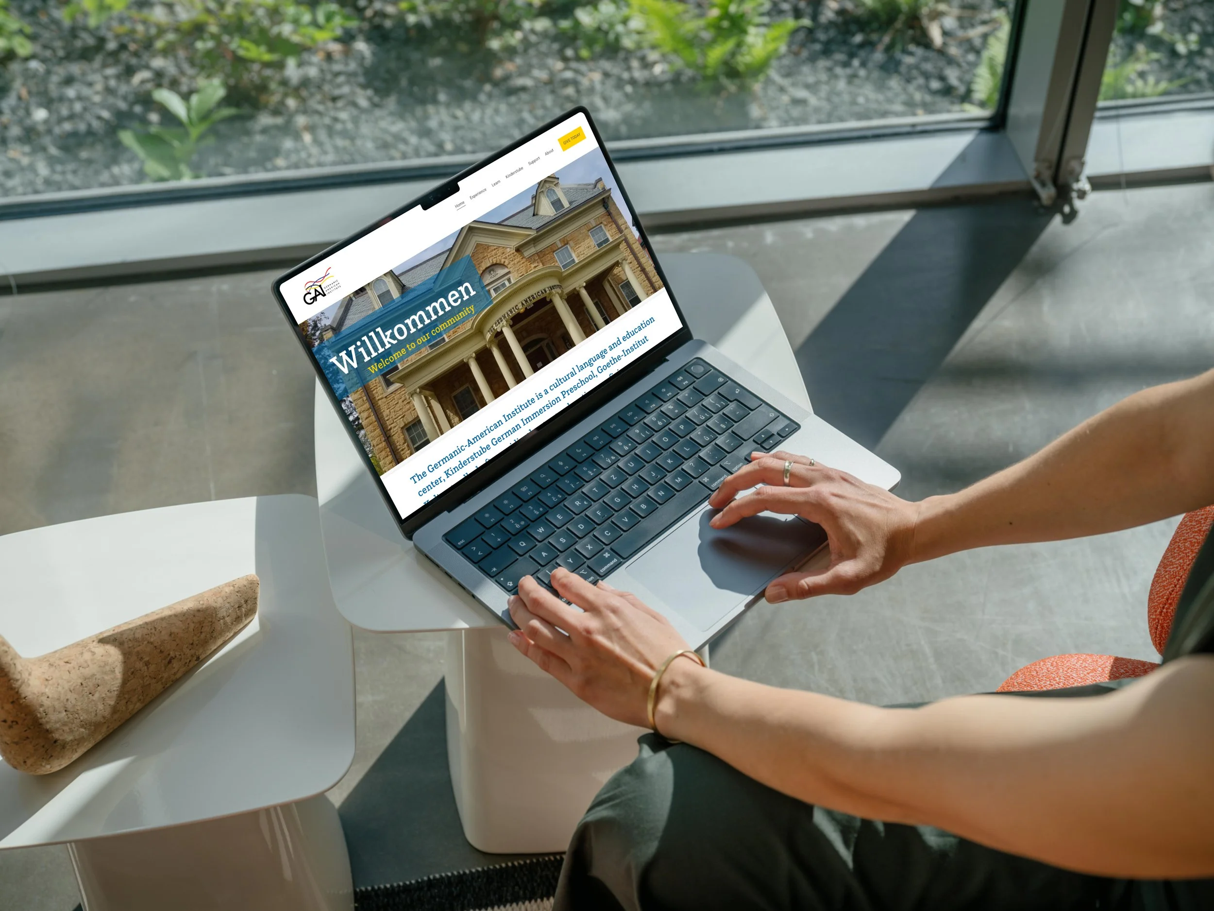
Germanic American Institute Website Redesign
Improving navigation, engagement, and program discovery
UX Design · Website Redesign · Squarespace
Project Highlights:
Role: UX Designer
Collaboration: Marketing Manager, Communications, Events, Leadership
Platform: Squarespace (custom enhancements)
Research: Surveys (57), Card Sorting (15), Testing
Project Highlights
Conducted competitive analysis and user research, including a survey with 57 participants, to inform design decisions and user personas
Improved navigation through card sorting with 15 participants, affinity mapping, user flow analysis, and a revised sitemap
Simplified site navigation to improve access to programs, events, and key resources
Designed and implemented a mega header consolidating frequently accessed pages
Enhanced content clarity and hierarchy for improved usability and discoverability
Designed and iterated on low- to high-fidelity wireframes and prototypes for core site pages
Conducted usability testing with members and staff, iterating based on feedback and cross-functional reviews
The Challenge
Confusing navigation
Fragmented content
Hard to find programs & events
Limited mobile usability
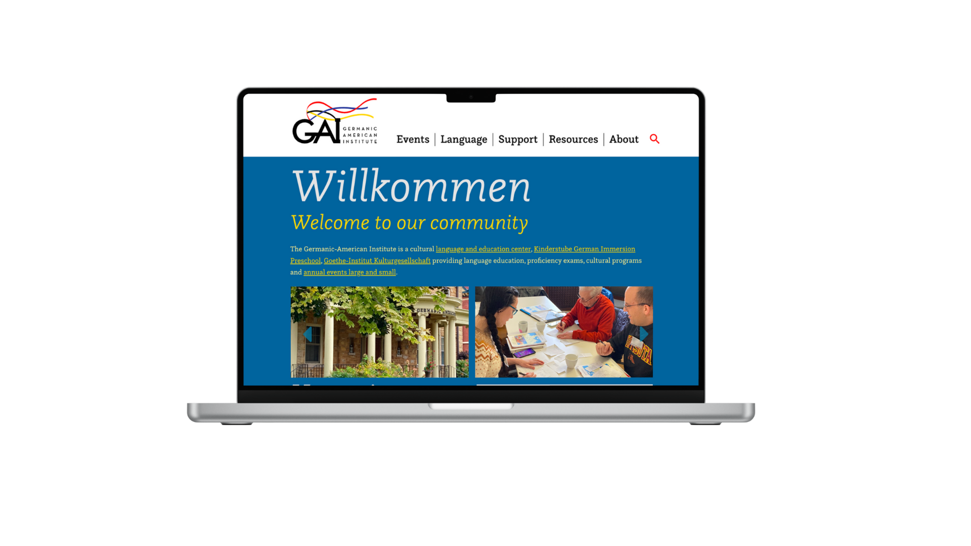
Previous website experience
Old home page
Old navigation close-up
GAI’s website needed to support a wide range of audiences and internal stakeholders, but the existing experience created friction for both users and staff.
Key challenges included:
Confusing navigation and inconsistent labeling
Difficulty discovering language classes, events, and calendars
Content structured around internal needs rather than user expectations
Limited engagement with programs and resources
The goal was to redesign the site to improve usability while supporting cross-departmental content needs.
Website Goals
Improve navigation clarity
Increase engagement with programs & events
Support multiple departments
Create a mobile-friendly experience
Website Goals
What we want to achieve with the redesign:
Improve navigation clarity and overall information architecture
Increase engagement with programs, classes, and events
Align content structure with user expectations rather than internal silos
Support multiple departments with a flexible, scalable content system
Maintain alignment with GAI’s branding and marketing strategy
Research
Methods
Survey & questionnaire (57 participants)
Card sorting (15 participants)
Stakeholder feedback
Usability testing
Survey snapshot
Card Sorting board
Affinity mapping
Survey snapshot
Card Sorting board
Affinity mapping


nnnnnnnn

Research Goals
What we need to learn to design the right solution:
Identify the primary goals and motivations of users visiting the website
Understand what users seek most from GAI’s online presence
Identify pain points and challenges in navigating the existing website
Evaluate how well the current layout and content meet user needs
Validate navigation structure, content clarity, and overall user flow through usability testing
Competitor analysis
I chose OneRecord and FollowMyHealth
because these popular apps help manage, store personal health records and communicate with healthcare providers in one place.
Analyzed each app based on:
key objectives
overall strategy
marketing advantages
SWOT analysis
UX competitive analysis
Conducted a competitor analysis in order to gain more insights into the current market and user expectations, helping me spot opportunities for my app.
Conclusion
Although OneRecord and FollowMyHealth offer robust platforms for storing medical information, they fall short in providing comprehensive wellness resources, giving the opportunity for others to offer a more holistic health management experience.


Survey
Created a user survey because I wanted a way to reach a broad audience. I used Google forms and shared on my social media and via email.
17 people participated
Target audience: health conscious individuals, 18+
Combination of multiple-choice questions and open-ended responses (see example below)


Survey Insights:
Major challenges: balancing work and personal life.
Helpful techniques to manage health: regular physical activities & healthy eating.
Goals: Form habits, improve fitness and mental health, reduce irritability, tips/tricks for time management and achieve goals, better organization, better quality of life, focus on the moment, weight management, tools for better mental health such as stress and anxiety, goals tracking, consistency and happiness.
Desired features: Personalized goal-setting and goal tracking, workout routines, recipes, stress management techniques, games, reminders, mood tracking, health and wellness articles, integration with wearables devices, sleep tracking and recommendations.
Interview
Conducted 3 user interviews in order to observe behaviors and facial expressions, gaining deeper insight into the emotions and experiences of people.
Interview script in order to give people a quick overview of the purpose of the interview.
11 open-ended questions focused mainly to better understand characteristics, behaviors and motivations of potential users. Identify needs, pain points and challenges, what kind of support do users seek, and what they hope to achieve in a health and wellness app.


Research Analysis
By asking WHAT? HOW? & WHY?
I gained access to insights into users’ needs, motivations and challenges.
Affinity Mapping
Created an affinity map in order to synthesize my research data, categorize user feedback, identify patterns and highlight key insights.

Key Insights
Users have a deep concern for their physical and mental health.
They seek to take control and be proactive in managing their overall wellness.
They desire assistance with organization, categorization, reminders and progress tracking.
Their goal is to achieve a balanced life and become their best selves through improved eating habits, health education, stress management, meditation and continuous self-improvement.
User Personas
Created 3 user personas to better understand and address the diverse needs and behaviors of Vita Sanus' potential users in order to ensure it meets their health and wellness goals.
These personas helped me to understand the target audience in a better way and make sure I could design with a user-centric approach.

These 3 personas reflect some of the main target users and their expectations. This allowed me to effectively design towards meeting their needs, and providing a user experience that meets their expectations.