Ingrid Dallet
Designed a responsive health and wellness portal for health-conscious individuals. It allows users to record and manage their health and medical information while providing a variety of features to promote physical and mental well-being
My role: UX/UI Designer
HCD Methods: Competitive analysis, user research, user personas, card sorting, affinity mapping, user flow analysis, low to high-fidelity wireframes, prototypes, usability testing.
Features: Recipe discovery, article favorites, and personalized reminders.
Tools: Figma, Canva, Usability Hub, Lucidchart, Unsplash

Ingrid Dallet
OVERVIEW
The challenge
Ingrid Dallet is a certified Access Consciousness Facilitator, EMDR psychotherapist, and Marriage & Family Therapist based in San Diego. She had been growing her practice through word of mouth and social media but lacked a central digital home that could serve two distinct audiences — English and Spanish speakers — while clearly communicating her unique blend of therapeutic credentials and transformational energy work.
She needed more than a website. She needed a brand, an information architecture that organized her diverse offerings (1:1 sessions, workshops, live events, memberships, a shop), and a platform that could handle bookings, email capture, and a bilingual experience — all within Kajabi's constraints.
Executive Summary
This project involved the full end-to-end creation of a professional, user-focused Kajabi website for a health and wellness coach. The objective was to establish a cohesive online presence that reflects the client’s brand values, supports business growth and provides seamless experience for current and prospective clients.
Project Highlights:
Conducted a competitive analysis to identify differentiation opportunities.
Developed personas to guide design and content decisions.
Completed client discovery interview to capture goals, voice and brand aspirations.
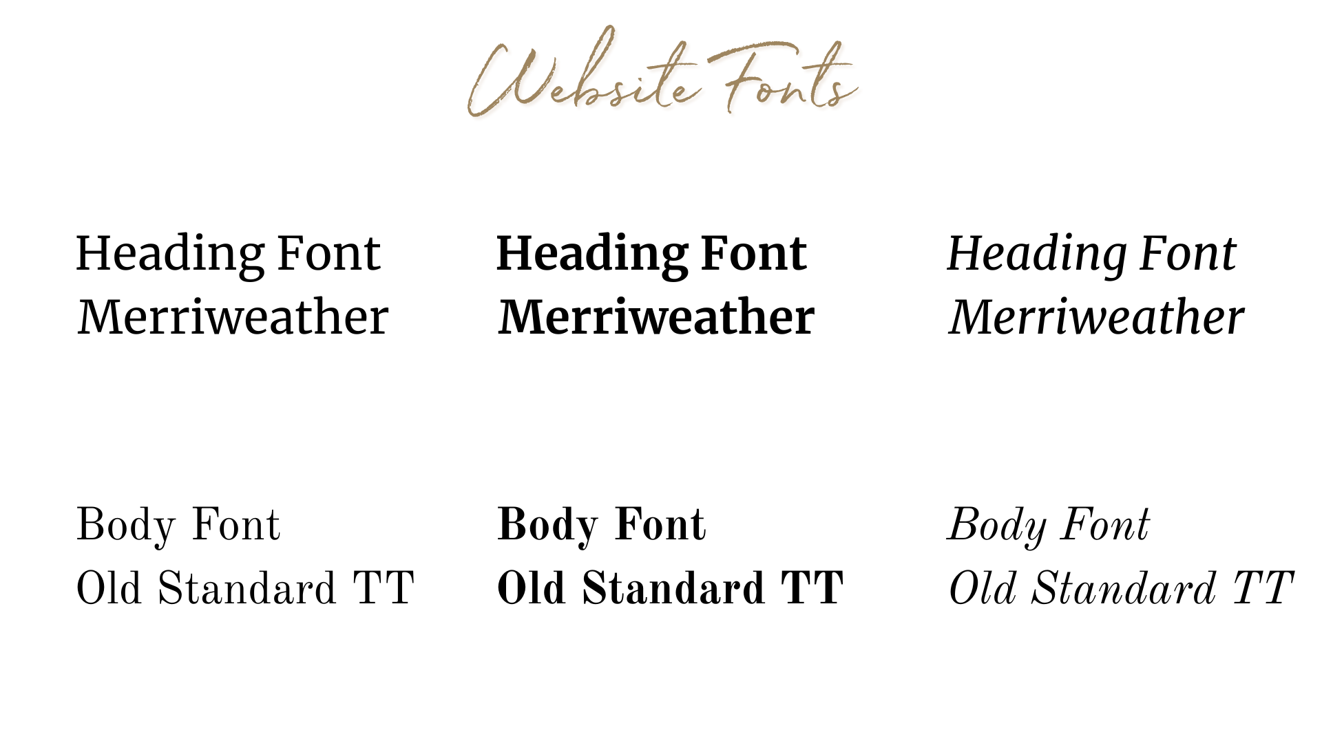
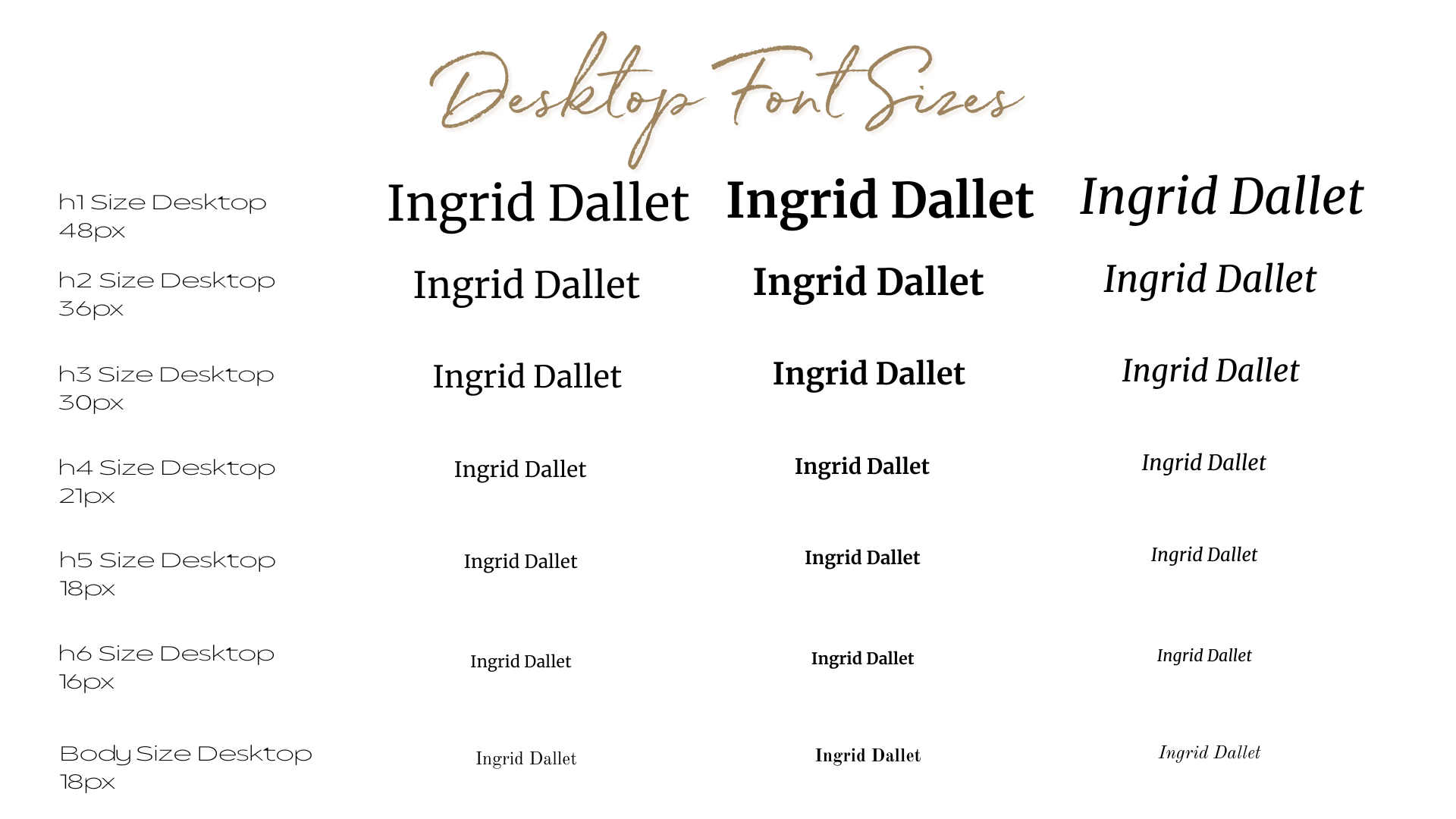
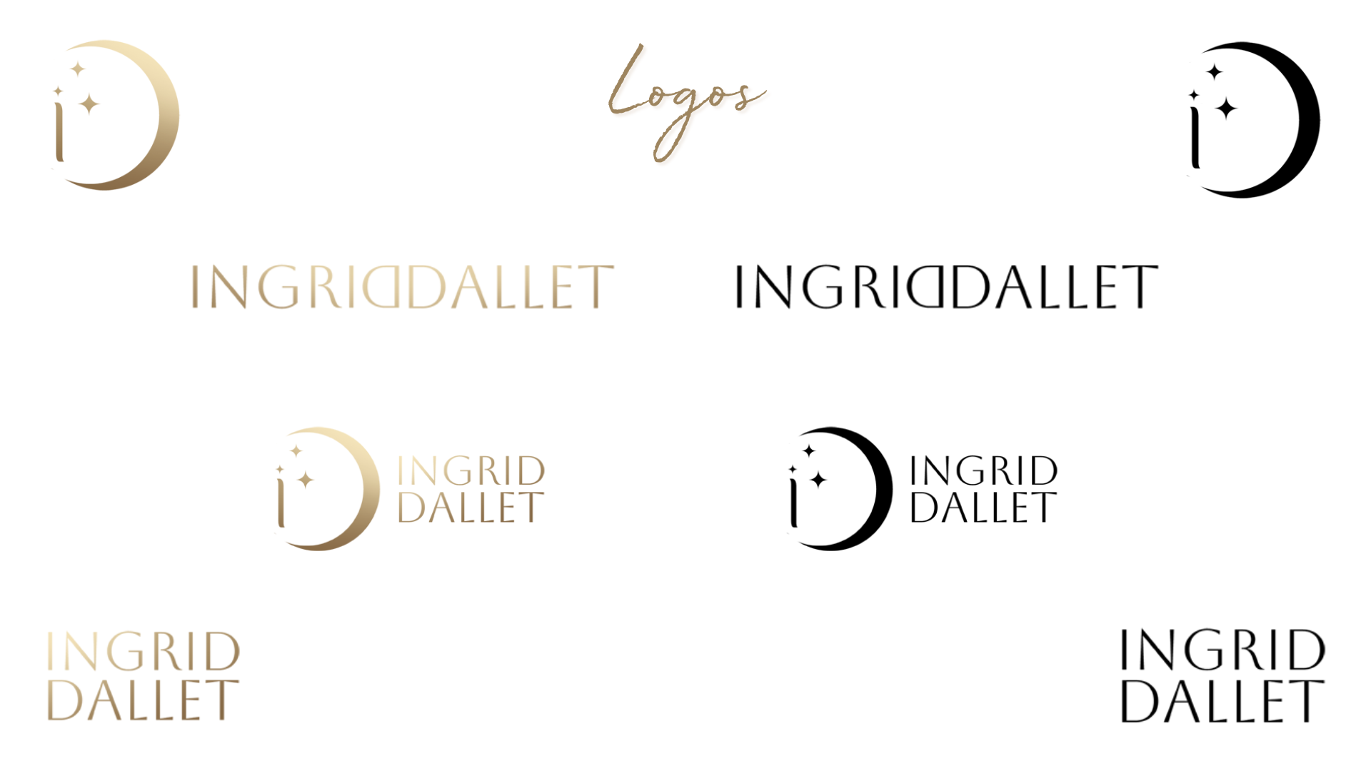
Created cohesive branding elements including logo direction, typography and color palette.
Designed and built a modern Kajabi website aligned with the client’s goals, aesthetics and usability best practices.
Developed intuitive site architecture and navigation for optimal user experience
Integrated key functional areas: Events and classes, online shop, wellness information, video and educational content.
Delivered responsive, mobile-optimized layouts.
Provided end-to-end project execution from research through launch.
Conducted usability tests with 3 participants, iterated based on feedback and collaborated in feedback rounds with Ingrid’s team.
Research
RESEARCH
Research questions & hypothesis
Research question 1
How do bilingual wellness seekers currently discover and evaluate spiritual facilitators online, and what trust signals matter most before booking a first session?
Research question 2
How do users navigate between complex service offerings (sessions vs. workshops vs. memberships vs. events) and what causes decision fatigue or drop-off?
Research question 3
What does a bilingual (English/Spanish) digital experience need to feel complete and intentional — rather than translated as an afterthought?
Hypothesis
If we create a bilingual website with clear narrative-driven navigation, warm and credible branding, and a logical hierarchy separating each service type — users from both language backgrounds will be able to find, understand, and book with Ingrid without confusion or friction.
Project Overview
My client Ingrid Dallet is a bilingual (English-Spanish) health and wellness coach blending holistic practices with Access Consciousness tools. She approached me to create a new digital home —a Kajabi website that feels mysterious, simple and intuitive while supporting her mission to help people expand their awareness and enrich their lives.
The goal was to design a platform that goes beyond the typical Access Consciousness facilitator website. Instead of focusing solely on energetic tools, she wanted a space where users could explore mind-body-energy wellness, discover events and classes, view videos, purchase products and ultimately feel invited into a transformative journey.
This project showcases my end-to-end process: research, competitive analysis, persona creation, UX strategy, branding and final experience design.
Research goals
To better understand the characteristics, behaviors and motivations of potential users.
To identify and document user needs, pain points and challenges with the help of similar apps on the market.
To identify what kind of support do users seek in their daily lives in order to achieve their goals.
To find out what users hope to achieve in a health and wellness app.
To determine what kind of desired features are our potential users looking for in a health and wellbeing app.
Understanding the Market Landscape
The landscape of Access Consciousness facilitators is unique. Many websites in this category assume prior knowledge, use advances terminology and position their brand around high-level transformational work. While powerful, this approach often leaves beginners feeling lost, intimidated or unsure where to start.
I analyzed XX competitors, including well-known facilitators. Across these platforms, I noticed consistent patterns:
Strong personalities, but little clarity for newcomers
High pricing and premium positioning
Niche specializations (business, money, creativity, etc)
Limited bilingual or multicultural accessibility
Heavy reliance on Access terminology
This revealed a clear opportunity:
Create a simple, welcoming, bilingual and holistic site that resonates with beginners and curious explorers.
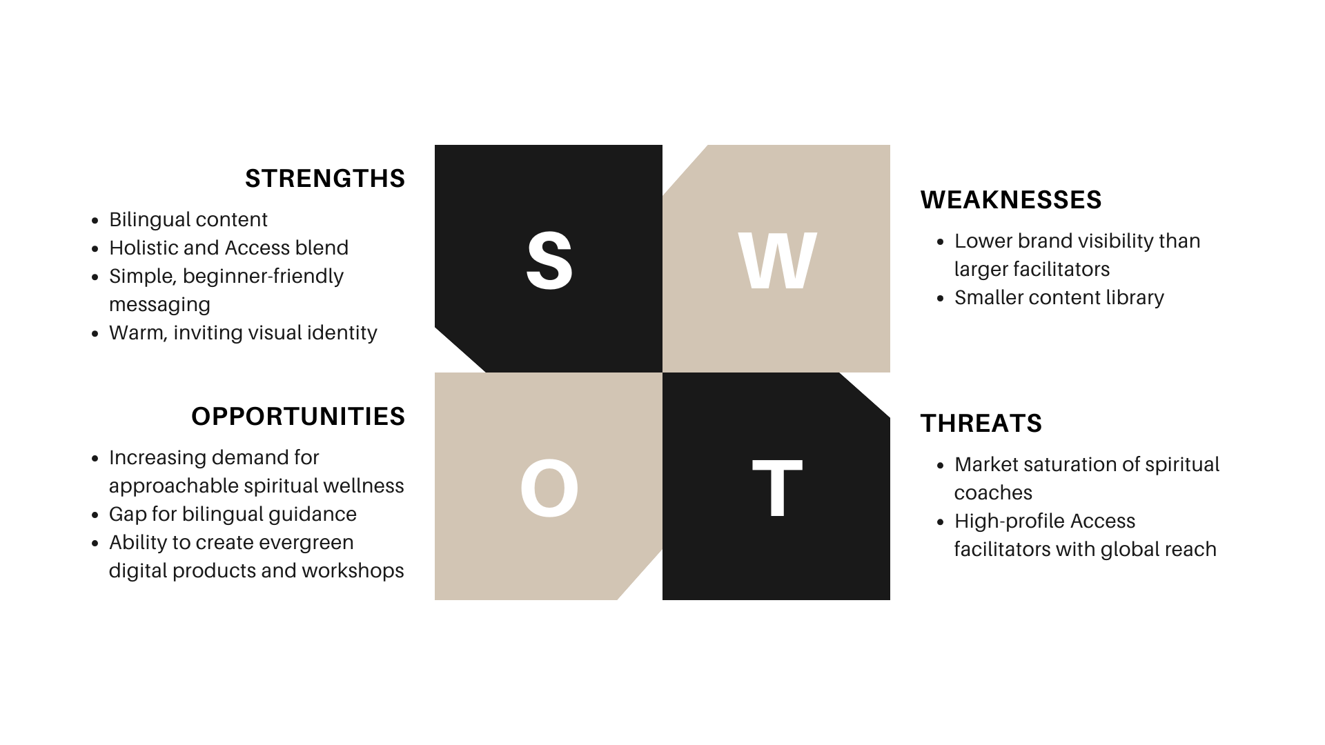
Through discovery conversations with Ingrid, I Identified her greatest differentiators:
Bilingual English-Spanish offerings (rare in this niche)
Holistic approach, not only Access Consciousness
Gentle, accessible tone for people new to inner work
Clear pathways instead of overwhelming options
A warm invitation to explore new possibilities
Competitor analysis
Conducted a competitor analysis in order to gain more insights into the current market and user expectations, helping me spot opportunities for my app.
Key Differentiators
What makes my client unique
Bilingual English-Spanish events and classes
Clear, simple, uplifting brand voice
Holistic practices beyond Access Consciousness
Integrated platform with workshops, events, shop and resources
Personalized, intimate experience vs large-scale programs
Friendly approach to Access tools
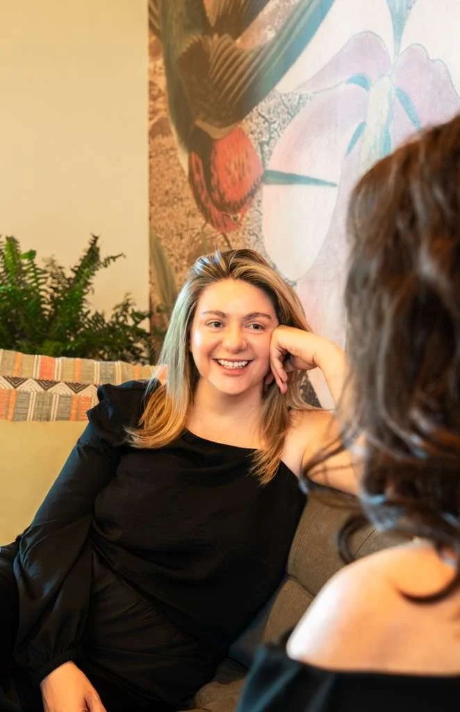
Client Interview
Ideate
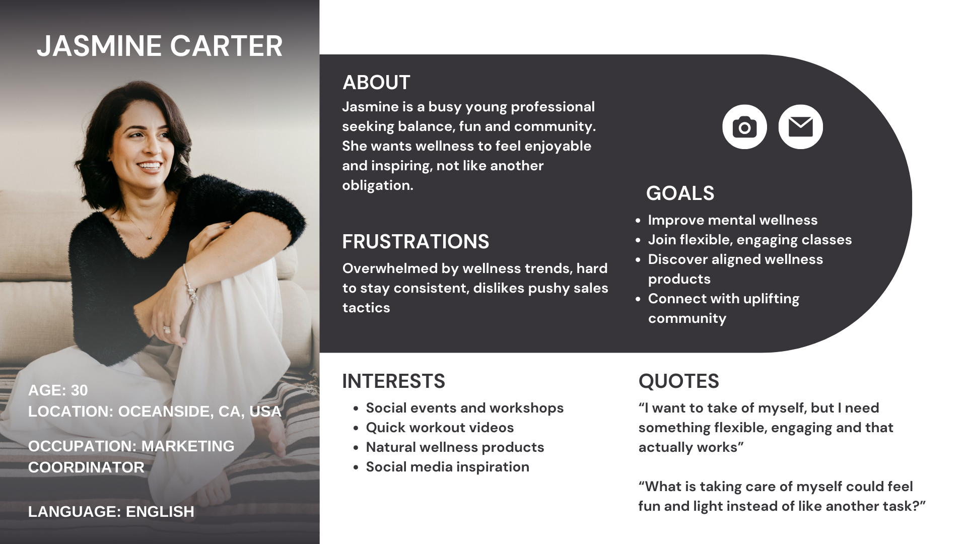
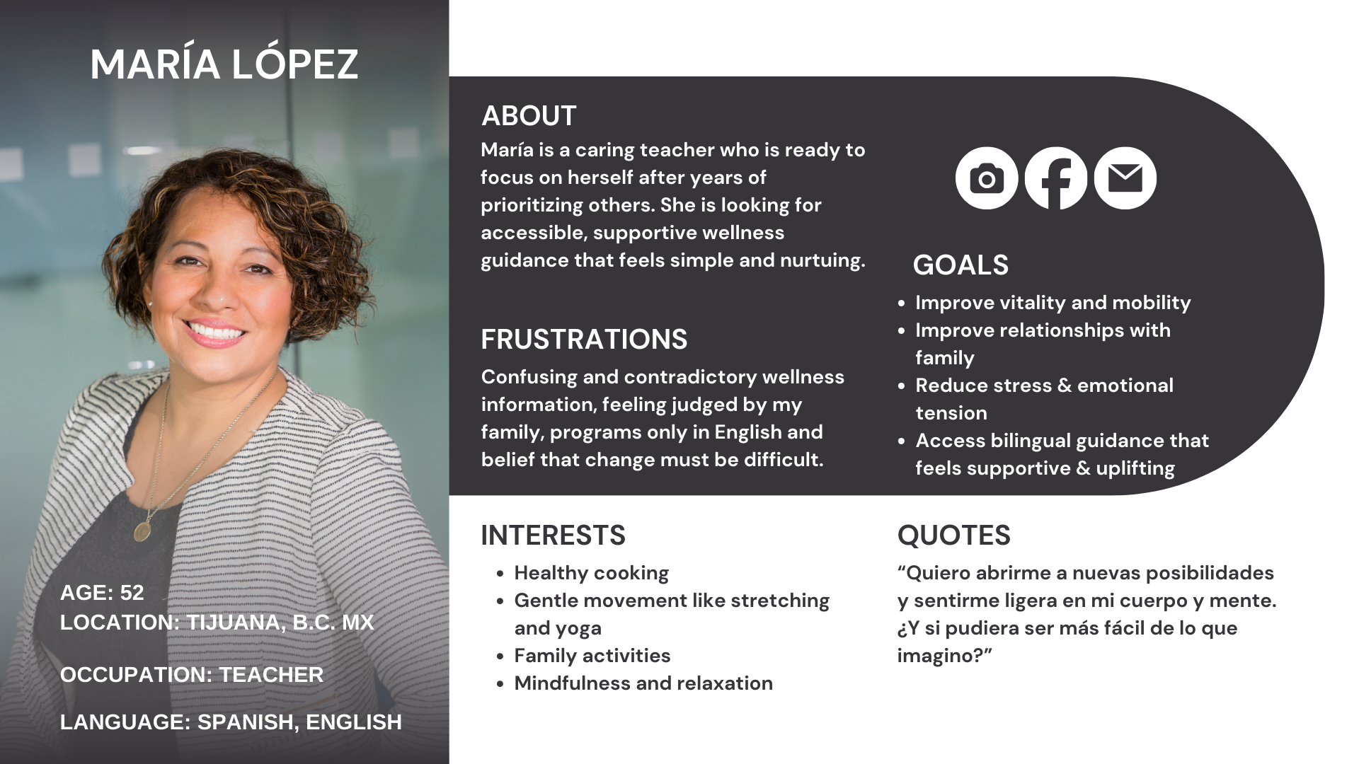
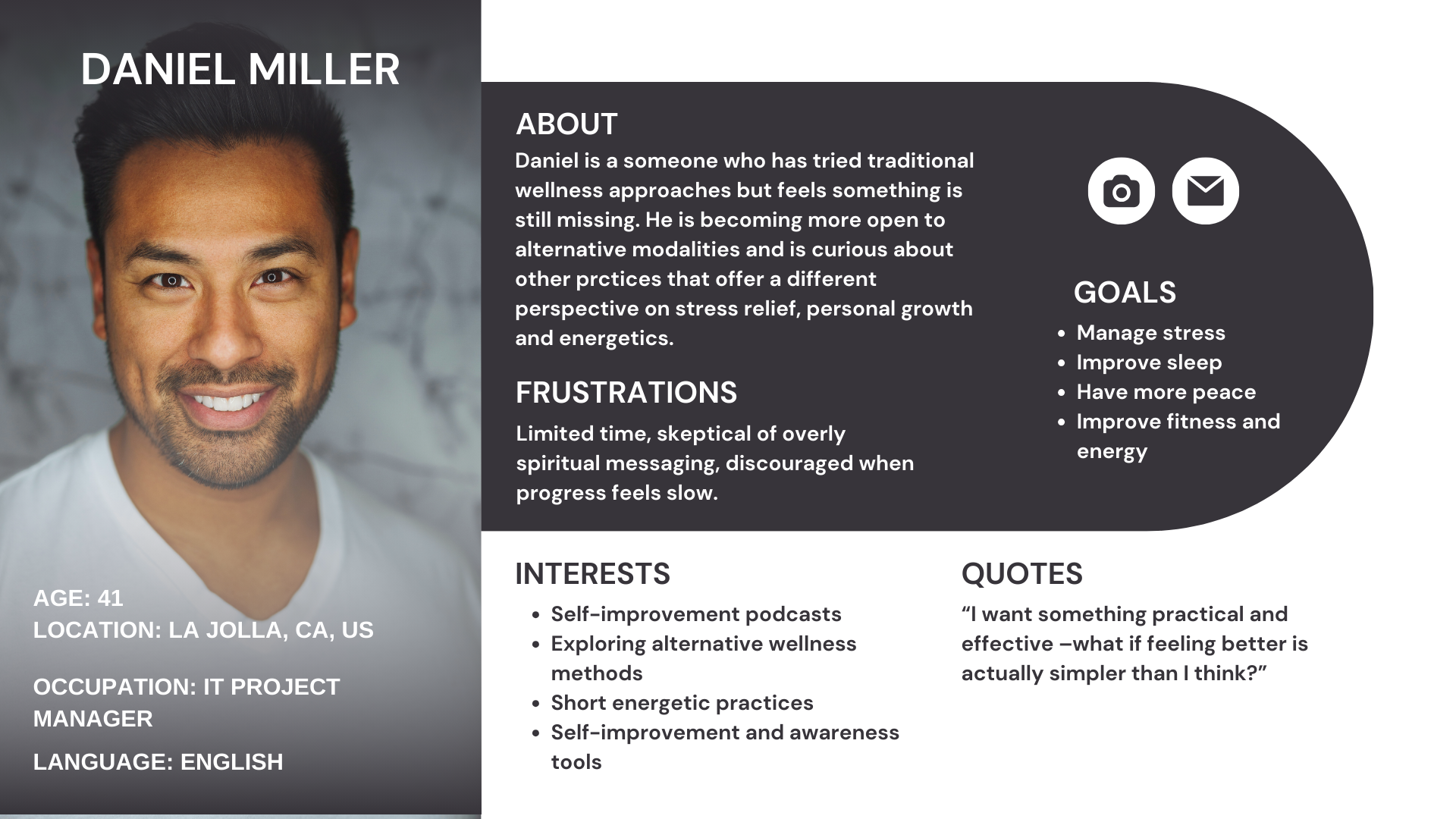
User Personas
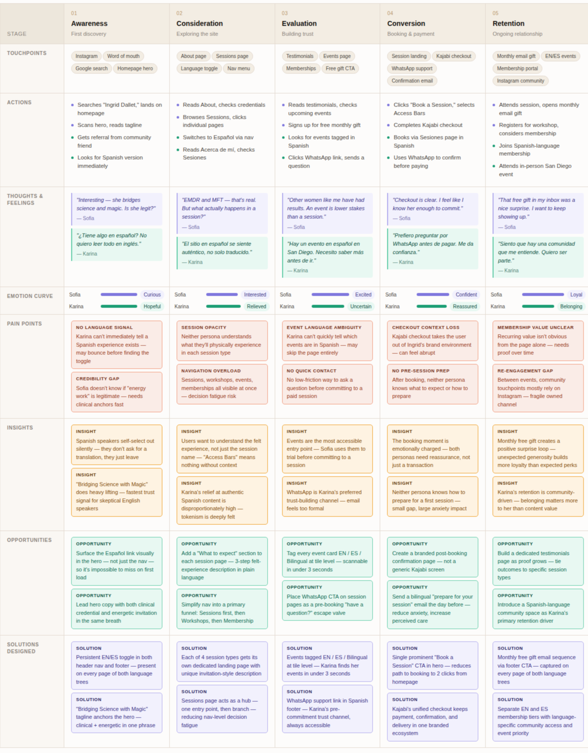
To understand her audience, I combined insights from:
Interviews with the client
her current follower base
Access Consciousness community trends
Broader wellness behavior patterns
Three user personas were developed to guide the design and creation of my client’s health and wellness website. By identifying distinct audience segments with different motivations, needs and behaviors, I was able to:
Design more intuitive and meaningful user experience
Ensure the website content, visuals and structure aligned with real user expectations
Create features that support engagement and retention
Shape branding and messaging that resonates emotionally with the target audience
Each of these personas represents a key user group the wellness coach aims to serve, helping the project stay focused on providing value, clarity and ease of use. These personas informed decisions such as bilingual content, shop offerings, community features, events and overall tone — resulting in a more inclusive, supportive and effective platform.
Implement
Website Branding
Brand Essence
Expansive, mysterious, elegant, grounded, simple, bilingual and conscious + holistic
Brand Personality:
A calm guide who opens the door to new possibilities. No intense. Not overwhelming. A blend of magic and practicality.
Voice and Tone:
Warm, welcoming, bilingual
Gentle guidance, not authority
Clear, grounded language
Avoids jargon and complexity
Invites curiosity and awareness
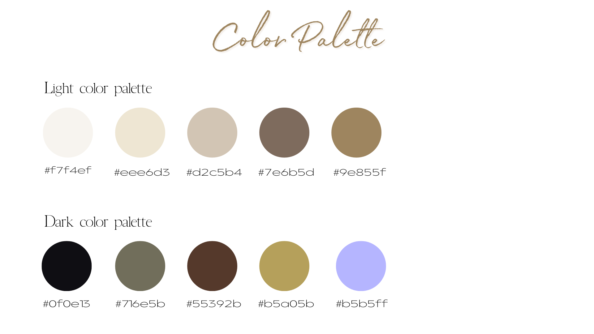
Color system
Light theme (Primary Use: Home, xx)
Emotional impact: Grounding, spacious, warm, approachable.
Color system
Dark theme (Primary Use: About, xx)
Emotional impact: Mystery, depth, possibility, elegance, introspective energy.
Testimonial
“From our very first conversation, she grasped not just the technical requirements, but the spirit and soul of what I was building.
She took full ownership of the branding and information architecture, guiding me through thoughtful decisions that felt intuitive to visitors while authentically reflecting my identity. The resulting brand communicates warmth, credibility, and a sense of expansiveness that resonates deeply with my clients.
What distinguished her most was her remarkable ability to collaborate. She listened — truly listened — to my goals, my concerns, and my instincts, then translated them into design decisions with skill and intention. Our working relationship was marked by mutual respect, open communication, and a shared commitment to getting it right.
She brought my vision to life with skill, sensitivity, and a level of professionalism that exceeded my expectations at every stage. She is the kind of creative partner who makes the process itself a joy — and the final product something you are proud to share with the world.”
-Ingrid Dallet

